Moodboard


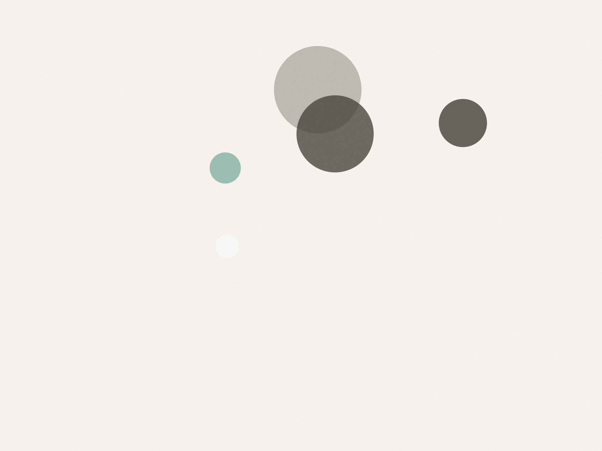
The magic here is domestic and quiet: a week that assembles itself like fog lifting off a kitchen window. Soft rounded forms drift into asymmetric calm, pastel light replaces alarm-red urgency, and every transition whispers 'it's already handled' rather than shouting 'new!'
This world is NOT…
- Never a primary-color grid, apple icon, or school-bus yellow — no gesture that smells of district-approved portals
- No badge counts, red dots, or urgency pulses; the interface never performs busyness back at the parent
- No hard-edged 'productivity dashboard' density — never more than one focal cluster per screen
- Primary-color calendar grids, school-bus and apple icons, cheerful teacher-portal UIs, busy notification badges, and taglines about 'staying connected to your school community'. The 'modern' redesigns go the other way: stark near-black-and-white layouts with one signal accent.
- Not a general email client, not a chore chart, not a school-sanctioned app that needs district IT to approve it.
Color
Typography
Concept
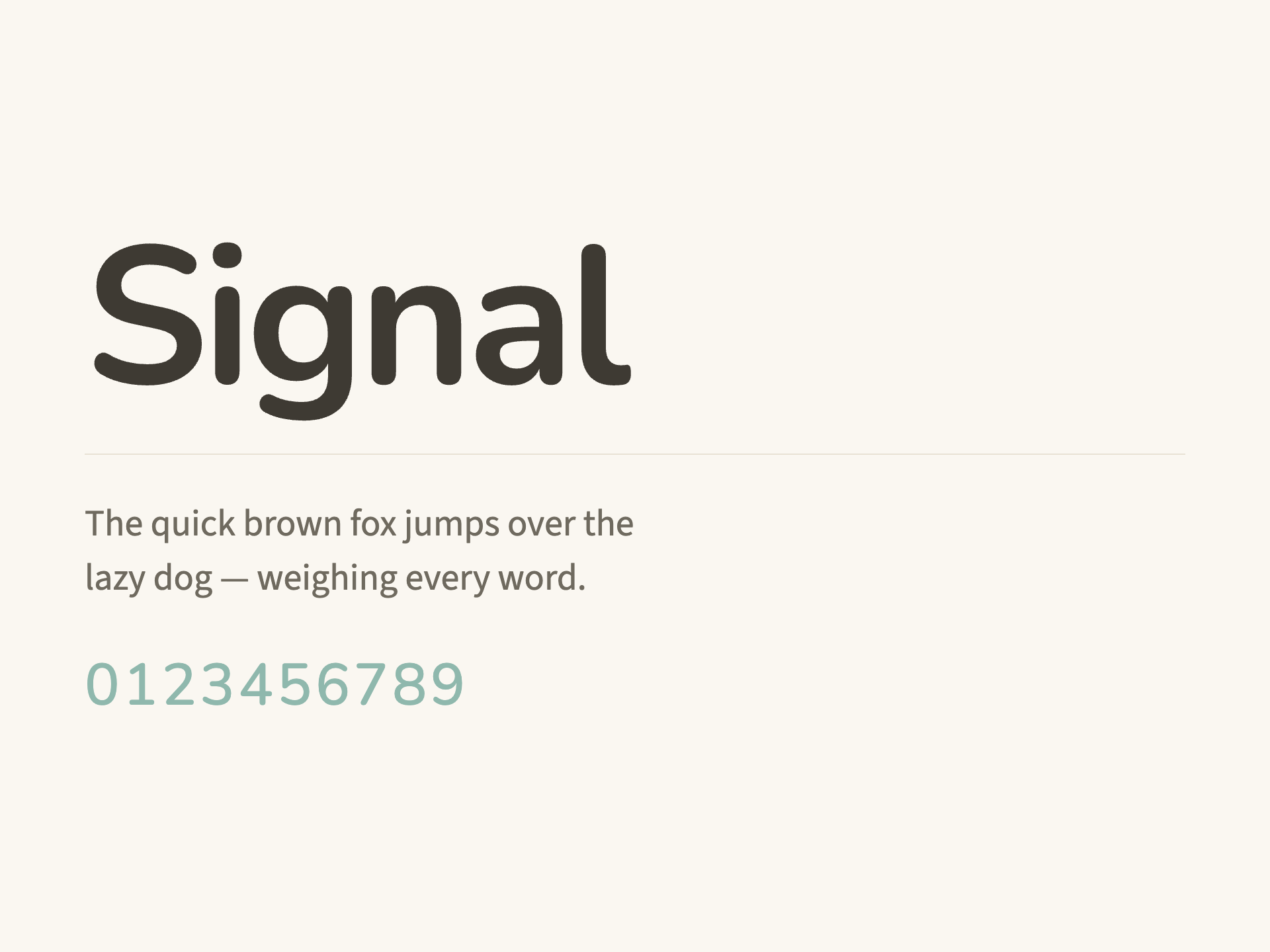
The coordinate fixes this brand at magician × humanist-rounded × muted-pastel × airy, and the vision translates that into domestic magic — fog lifting off a kitchen window. So the palette refuses both category norms named in the brief: no primary-color school grid, and no stark near-black-and-white signal scheme. Instead, the ground is warm linen (#FAF7F1) with washi-toned surfaces (#FFFDF8) and a warm charcoal ink (#3E3A33) — early kitchen light rendered as hex. The single accent is a muted sage-teal (#8FB8AD), pastel enough to whisper, deep enough (with #25403A ink) to carry the one CTA. Critically, danger is a soft terracotta (#C68370) rather than alarm-red, because the anti-moves forbid urgency pulses: even error states must not perform busyness back at the parent. The humanist-sans typeVoice and humanist-rounded formLanguage led to Nunito for display — its rounded terminals are the typographic equivalent of the rounded paper-tab tiles in section s3 — paired with Source Sans 3, a warm, highly legible humanist body face that reads like plain kitchen-table speech. Radii run large (10/16/24) to keep every surface soft-cornered like stationery, and shadows are the literal signature move: sm is the 2px lift each extracted event takes as it rises from inbox murk, md is the hover state's faint pastel glow, lg is reserved for the hero week card at focalWeight 5. Motion honors the 'subtle' coordinate — an ease-out default (cubic-bezier(0.33,1,0.68,1)) so everything settles rather than snaps, matching the FAQ rows in s4 that 'ease open slowly'. The composition plan shaped the spatial and voice systems directly. The split-asymmetric, image-led hero with the week card 'settled low-left with generous sky above' demanded an airy 9-step space scale topping out at 128px and a voice that lands in one breath — hence the hero copy 'Your week was in the inbox all along.' The focal hierarchy (s1 > s3 > s6) is enforced structurally: shadows and radius prominence peak at the hero, the showcase tiles reuse the Card at medium lift, and the CTA repeats the exhale gesture with the sole primary button low-left. The voice rules — past-tense magic, settled verbs, no urgency vocabulary, no district-memo language — are the archetype's quiet spell written as editorial law: the interface never shouts 'new!', it only says 'it's already handled.'
Voice
Personality
Tone rules
- Speak in the exhale, not the alarm: every sentence should lower the reader's heart rate, never raise it.
- Describe what is already done, not what the user must do — the product's magic is past tense ('it's on your calendar'), not imperative ('add it now!').
- Keep sentences short and domestic. Kitchen-table language, not district-memo language: 'the bake sale' not 'the fundraising event opportunity'.
Do
- Name real school-life objects plainly: permission slips, snack duty, early dismissal, the field trip.
- Use soft, settled verbs — 'lands', 'settles', 'lifts out', 'assembles' — to describe extraction and sorting.
- Let whitespace do the emphasis; one idea per line, generous pauses, headlines that could be said in one breath.
Don't
- Never use urgency vocabulary: no 'don't miss', 'act now', 'reminder!', exclamation-point stacks, or countdowns.
- Never speak like a school portal or district communication — no 'stay connected to your school community', no administrative jargon.
- Never perform busyness back at the parent: no unread counts, no 'you have 14 new items', no gamified streaks or productivity scores.
Example copy
Your week was in the inbox all along. We just read it for you.
Connect your inbox. By morning, this week will have sorted itself. — [ See my week ]
Powered by Variel
Make your own brand
Generate a living design system — tokens, voice, components, and moodboard — in minutes. Share it publicly. Enforce it automatically on every pull request.
Generate your brand