Moodboard
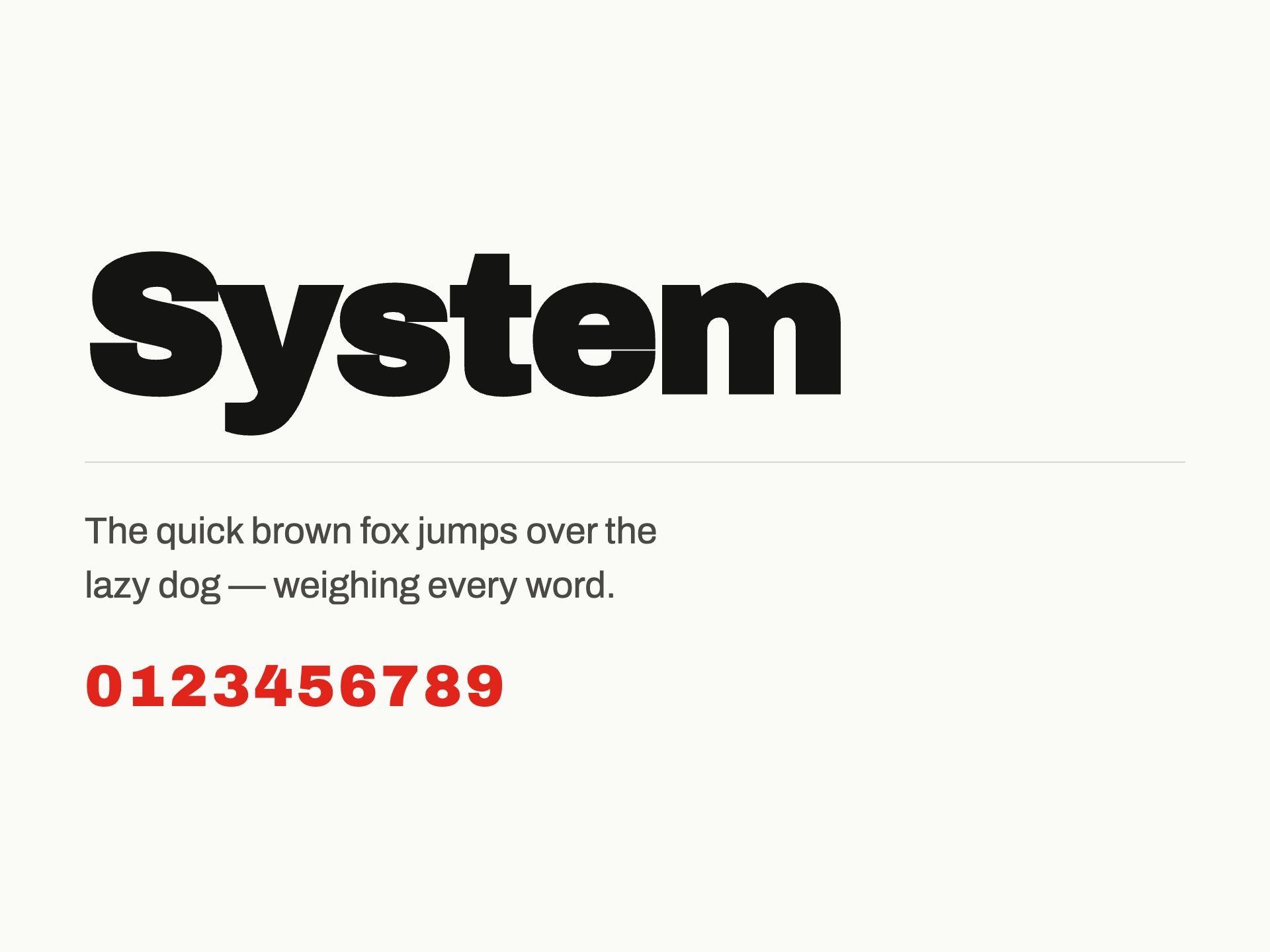

Quorum looks like the memo itself seized the website: dense black grotesque on raw white, one alarm color for the verdict. If the industry judges you on four minutes, the design worships the four minutes and openly despises the twenty hours — it's a manifesto against billable
This world is NOT…
- No navy, no gold, no serif gravitas — nothing that flatters the hierarchy the product exists to break
- No dashboards cosplaying Bloomberg; never a chart shown for atmosphere rather than argument
- No handshakes, glass towers, or the word 'sophisticated' — no imagery of finance performing finance
- Navy-and-gold gravitas, serif headlines, stock photos of handshakes and glass towers, the word 'sophisticated' in the hero, and dashboards impersonating a friendlier Bloomberg terminal.
- Not a CRM, not a data room, not a portfolio-analytics dashboard.
Color
Typography
Concept
The coordinate stack — outlaw archetype, brutalist-raw form, near-bw-signal color — plus a vision that says 'the memo seized the website' resolves into one material metaphor: the photocopied working file. So the palette is toner and paper, not black and white: bg #FAFAF6 carries the faint warmth of copy stock, ink #141412 is near-black toner that never goes pure, and the single signal is #E1251B — an alarm red pulled from approval stamps and redline markup, used for exactly one job per surface (the verdict). Success, warning, and danger are deliberately muted and ink-adjacent so nothing competes with the red line; the categoryNorm's navy-and-gold gravitas is refused entirely, and there is no serif anywhere in the system. Archivo Black and Archivo answer the grotesque-sans typeVoice at newsprint density: a heavy, unornamented specimen-sheet grotesque for the offset-editorial, type-led hero, and a workhorse grotesque with a 12px floor for the wall-to-wall memo text the signature moves demand. Dense spatialDensity and asymmetric-dynamic logic show up in the token layer as a tight lower spacing band (4/8/16 doing most of the work), zero-to-2px radii, and hard offset shadows with no blur — pages lifted off a stack, not floating glass panels. That shadow language directly serves the tactile-raw finish and the composition plan's photocopied-exhibit imagery in s1, s3, and s5. The lively motionCharacter becomes 'redline motion': fast durations (80–150ms for annotations), a snap-in default curve, and an overshooting spring for stamps landing — annotations marked live, never elements drifting in ambiently. The composition plan's focal hierarchy governs component weight. S1 and s2 (focal 5 and 4) get the system's loudest instruments — the 64px display scale, the circled red line, colliding column structures — while s8 gets only hairlines, 12px type, and the 'page 8 of 8' colophon. Components are built as courtroom material: the Button is a stamp (one red verdict per view, secondary actions as ink annotations), the Card is an exhibit with exposed timestamps and page references, executing the vision's 'evidentiary, not glossy' directive for s5 and s6. Voice rules encode the anti-moves as hard prohibitions — no 'sophisticated', no atmospheric numbers, no finance performing finance — and the example copy walks the section sequence from indictment (s1) through refusal (s4) to signed verdict (s7), so the language system and the token system make the same argument: worship the four minutes, despise the twenty hours.
Voice
Personality
Tone rules
- Write like a partner's markup, not a marketer's pitch: short declarative verdicts, struck-through wrong answers, no throat-clearing.
- Every number must argue. State hours, minutes, sources, and drafts as evidence; never cite a figure for atmosphere.
- Attack the ritual, never the reader. The twenty hours is the villain; the associate is the one we're arming.
Do
- Lead with the verdict, then show the exhibit — thesis first, support second, like a memo a partner would actually keep reading.
- Use working-file language: timestamps, page numbers, file references, DRAFT and RECOMMEND stamps as copy elements.
- Name the trade openly: 'twenty hours drafted, four minutes judged' — say the quiet part in the headline.
Don't
- Never use 'sophisticated', 'seamless', 'elevate', or any word that flatters the hierarchy the product exists to break.
- Never soften a refusal into a comparison table of checkmarks — refusals are struck lines, stated flat: NOT a CRM.
- Never describe the product as magic or effortless; describe it as evidence assembled fast, work made judgeable.
Example copy
Twenty hours drafted. Four minutes judged. The memo shouldn't depend on the hours you happened to have.
NOT a CRM. NOT a data room. NOT another dashboard. Quorum is the memo the partner actually reads — thesis, risks, comps, recommendation. Page one, no scrolling.
Stop billing hours to a four-minute read. Draft your first memo. — Filed today, 14:02.
Powered by Variel
Make your own brand
Generate a living design system — tokens, voice, components, and moodboard — in minutes. Share it publicly. Enforce it automatically on every pull request.
Generate your brand