Moodboard
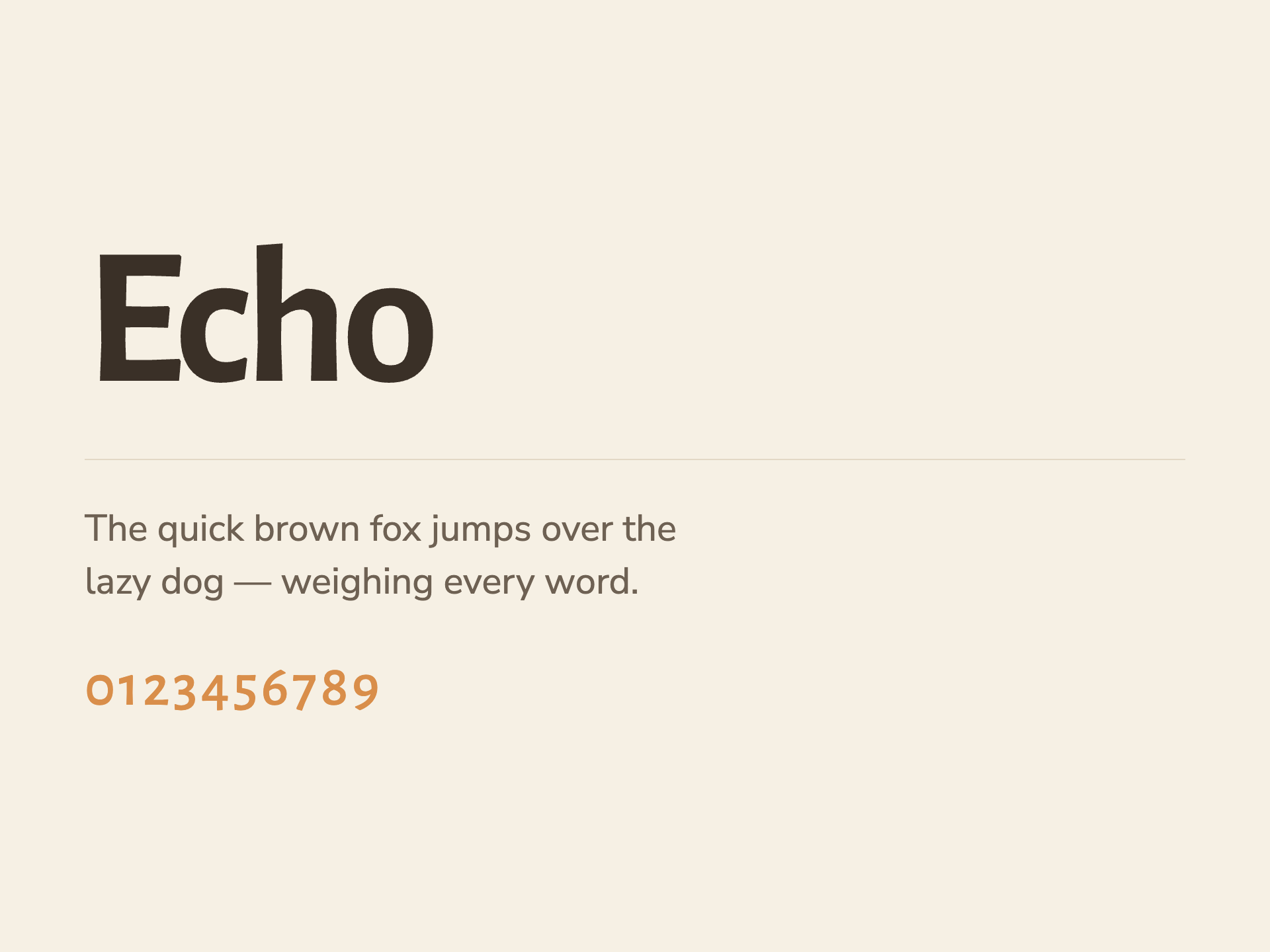

Design as the last exhale of the day: a warm lamplit room rendered in soft-edged organic shapes that settle off-center like a child sinking into a pillow. Every element lowers its voice — type speaks at a whisper, color holds one ember of accent, motion moves at breathing pace.
This world is NOT…
- No pastel-cloud gradients, star confetti, or grinning mascot animals — nothing that performs cuteness at the child
- No bouncy easing, sparkle particles, or attention-grabbing motion; nothing on screen ever moves faster than a breath
- No stark black-and-white 'premium' austerity — coldness is as wrong for bedtime as noise is
- Pastel-cloud gradients, smiling cartoon animals, bouncy rounded sans-serifs, star-and-moon confetti, and taglines about 'sparking little imaginations'. The 'premium' variants go the other way: stark near-black-and-white editorial layouts with a single signal accent.
- Not an audiobook library, not a screen-time destination, not a character-IP franchise.
Color
Typography
Concept
The coordinates set the position — caregiver, organic-irregular, humanist-sans, airy, warm-neutral-1-accent, subtle-depth, subtle motion — and every token is a direct consequence. The palette builds a lamplit room in hex: oat (#F6F0E4) and deepened oat (#EFE7D6) grounds, cream surfaces (#FAF5EB, #FFFCF4) that lift a half-step like paper under lamplight, and warm-brown inks (#3A3027 down to #98897A) that never approach the cold black the anti-moves forbid. The single dusk-amber accent (#D98E4A) is the vision's 'one ember' made literal — it appears once per screen, on the primary CTA, hovering darker (#C67C3B) rather than brighter, because at bedtime nothing should intensify. Even the shadows are tinted warm brown (rgba(76,58,38)) rather than neutral gray, so the subtle-depth finish reads as lamplight falloff, not UI elevation. The humanist-sans typeVoice ruled out both the category's bouncy rounded sans and the 'premium' editorial serif. Alegreya Sans brings calligraphic warmth at display weights — a voice that speaks softly even at 64px for the type-led, offset-editorial hero — while Nunito Sans carries body copy with the gentle openness a tired parent can read at 7:45pm. Organic-irregular formLanguage is executed structurally: the radius scale runs large (12/22/36) and, critically, components use asymmetric four-value border-radii so every container is a hand-drawn blob, no perfect circles, honoring the 'shapes seen through half-closed eyes' signature move. The airy density and asymmetric-dynamic logic live in the space scale's long tail (96, 128) and in usage rules that push content toward the lower-right — the composition plan's drift-to-rest gesture from hero through CTA. Motion and voice complete the exhale. All easing curves are deceleration-only — the 'spring' (0.32, 0.72, 0.36, 1.0) has zero overshoot because bouncy easing is an absolute anti-move — and the slow duration (400ms) governs any visible transition, pacing the interface to a resting breath. The voice system encodes the composition plan's descending emotional temperature: sections end on their shortest, quietest line; benefits are framed as subtraction (lowering, softening, ending well); and the do/don't lists explicitly refuse both the category's confetti-cuteness and the premium variant's cold austerity, per the antiPosition. The focal hierarchy is honored in token allocation: s1 gets the largest type and the amber ember, s6 gets the only other warm gesture, and s7 settles into the deepest neutral — the room after the lamp clicks off.
Voice
Personality
Tone rules
- Write at the volume of a parent's voice trailing off — declarative sentences that get shorter as the section descends, never a raised pitch or an exclamation point.
- Speak to the exhausted adult, not the child; acknowledge the empty tank without dramatizing it, then offer one calm next step.
- Frame every benefit as subtraction — lowering, softening, quieting, ending well — never as sparking, boosting, unlocking, or delighting.
Do
- Name the real nightly stakes plainly ('how the night ends') and let generous white space carry the emotional weight.
- Use time-of-day and room language — lamplight, blanket, the last page — grounded in the physical wind-down ritual.
- End sections on a settling note: the final line should always be the quietest and shortest one in the block.
Don't
- Never use exclamation points, sparkle emoji, 'magical', 'adventure', or any copy that performs cuteness at the child.
- Never borrow app-growth language — no 'streaks', 'unlock', 'binge', 'library of thousands' — the product is one story, once, tonight.
- Never go cold or clinical to seem premium; austerity and jargon are as wrong for 7:45pm as noise is.
Example copy
One wired child. One tired parent. One story decides how the night ends. Lull composes tonight's story from how today actually went — written to lower the temperature of the room, not raise it.
The day is almost done. Let tonight end gently. — Hear tonight's story
Powered by Variel
Make your own brand
Generate a living design system — tokens, voice, components, and moodboard — in minutes. Share it publicly. Enforce it automatically on every pull request.
Generate your brand